Real Estate Website — The Details Page
The listing page gets the user interested.
This is where someone decides: is this the one?
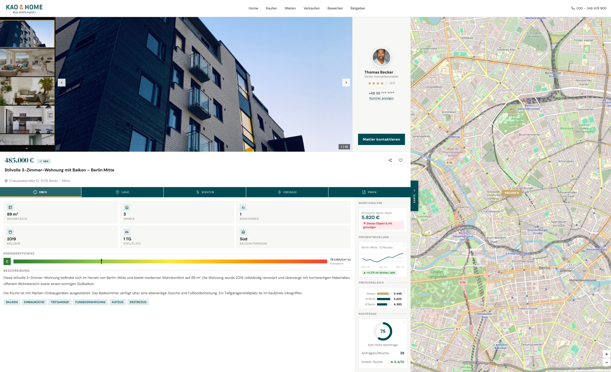
So the UX had to answer every question before they even think to ask it:
- A full photo gallery — because people buy with their eyes first
- A split view — list and map, side by side
- Key details above the fold: price, size, rooms, location — no scrolling to find the basics
- Tabs that organize the rest: info, location, costs, energy, commission — clean, not overwhelming
- The broker is always visible — one click to make contact
- A live market analysis panel: average price per m², how this listing compares, price trend over 12 months, demand score
- And the map — always open, always in context
The hardest part wasn’t the layout. It was deciding what belongs on this page — and what doesn’t.
That’s a product decision, not a design one.
Prototype: vorozhkojulia.github.io/real-estate-site